October 26, 2021
UX Questionnaire | How to choose the right one?
You want to evaluate the usability of a website, a mobile application or a new service, but you do not know which UX questionnaire is the most relevant? Then this article is for you! After a quick overview of the different qualitative and quantitative approaches, discover which survey to choose according to your needs. AttrakDiff and others will soon have no secrets for you!
Contents:UX Questionnaire | What you need to know
The structure of a UX survey
Sample size and feasibility
AttrakDiff | The most complete UX survey
SUS | The technical approach for prototyping
UMUX and UMUX-Lite | Measuring usability with simplicity
NPS | For UX research recommendations
The Kano model | Categorizing and prioritizing features
UX Questionnaire | What you need to know
In UX research, there are several types of studies. Depending on your objectives, you will choose one or the other. Qualitative studies are relevant if you want to conduct individual interviews or focus groups, for example. In short, they are often open-ended interviews with few users and are based more on subjective elements than on concrete facts. The purpose of a qualitative study is to discover and understand behavior. Overall, it answers the questions “why” and “how”.
In contrast, quantitative studies (and this is what we are interested in here) are ideal for measuring and answering the “what”, and potentially “who”, questions. Quantitative questionnaires are standardized and more directive; they make it possible to question a large number of users. The tangible elements that emerge will allow you to know, for example, if your user interface is adapted to your objectives. Or whether it is better to opt for skeuomorphism or flat design to meet your users’ expectations. It is therefore necessary to have an idea of the objectives you want to achieve before launching a UX questionnaire.
The structure of a UX survey
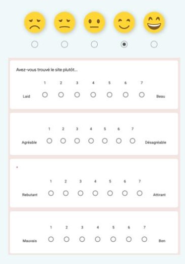
In its basic form, it is generally based on closed questions, measured using the Likert scale. The latter allows the user to evaluate their level of agreement with a sentence (question or statement) on a scale of 1 to 5 or 1 to 7.
These questionnaires generally range from 2 to 100 items (meaning questions) and are mainly used for 3 purposes:
- single assessment: the idea is to gather a score and see how it falls on the given scale
- compare A and B to see what comes out and choose the most suitable version
- compare a service or a design system before/after
Some surveys, such as the AttrakDiff, even allow you to measure a broader scope than just the usability or ergonomics of an experience. Thanks to these metrics, you can evaluate progress from one iteration to the next and compare it to similar experiences. But beware: these tools should be taken for what they are worth and their results depend on the sample. If they are used with a small sample, the score can easily vary and is an indication rather than an absolute truth. This is the purpose of the margins of error and confidence intervals attached to your sample size, to indicate the reliability of the numbers obtained. Note that the questionnaires discussed in this article are translated into many languages.
Sample size and feasibility
In order to have methodologically valid data, it is important to maximize the number of participants. 100 is a respectable sample size. If you run your UX test on less than 30 individuals, you will need to be careful about its significance. This sample size is too small for the result to be more than just an additional metric to add into your UX analysis. Beyond that, depending on the sample size, you can use the margins of error to see how much you can trust the results. The choice of your UX questionnaire therefore relies on the different objectives you are aiming for. Because, as you will see, not all of them meet the same needs.
AttrakDiff | The most complete UX survey
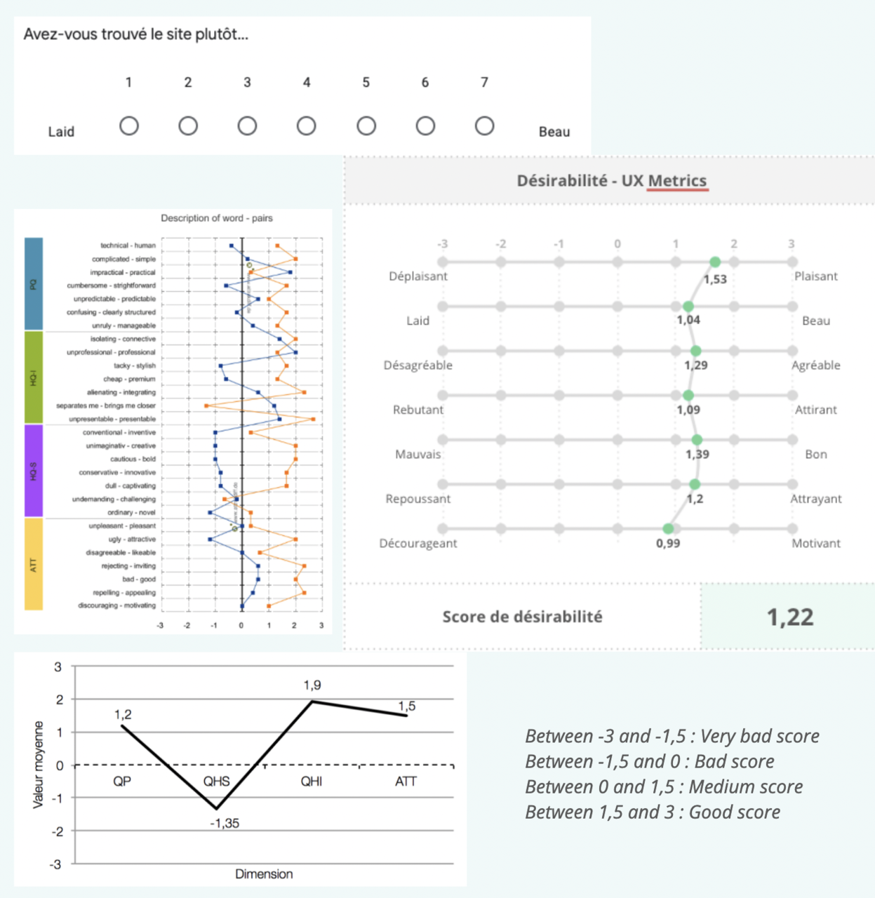
Designed by a German agency in 2003, this standardized survey is one of the most comprehensive that exists today. Widely used in many countries, and especially in Europe, it allows to rate an experience with a global score, using several different metrics. AttrakDiff is composed of 4 subscales, each comprising 7 items. These 28 items in total are scored from -3 to 3. The advantage of this measure is that it gives a broad overview of your project, as it takes into account not only ergonomics and usability, but also the pragmatic and hedonic scales.
The pragmatic scale gives indications on the product/service itself and is based on the realization of specific tasks. The hedonic scales, on the other hand, are related to the user. They determine how the user will identify with the product and how it will stimulate them.
The AttrakDiff subscales:
- The Pragmatic Quality (PQ) scale: this is an evaluation of the usability of the product/service. It indicates the extent to which users can use it to achieve their objective(s) and focuses on criteria such as efficiency, flexibility, clarity, etc.
- The hedonic quality – stimulation scale (HQ-S): This scale indicates how the user perceives the brand in its positioning. It describes how the product stimulates them, through its functionality and added value. In short, a stimulating product is one that is creative, captivating, original, etc.
- The hedonic quality scale – identification (HQ-I): this scale is related to the previous one, because it also focuses on the stimulation of the user’s pleasure. It defines at what level the product aligns with the identity of the user and how they interact with it.
- The overall attractiveness scale (ATT): based on the pragmatic and hedonic qualities, this last scale indicates the overall value of the product.
When to use AttrakDiff?
- When you want to focus on the complete experience, have a broad overview of your project;
AttrakDiff is also interesting because it allows you to isolate only one of the 4 subscales if needed. For example, if you want to measure the attractiveness of your website, you can use the ATT scale and couple it with another type of UX survey.
However, it is better to avoid using AttrakDiff for wireframe prototypes. Indeed, for its indications to be relevant, you need to have enough material to get a good idea of the brand/product and its universe. These elements are generally visible later in the design process, starting with the UI layer. In the case of a low-fidelity prototype, it is better to use SUS or UMUX/ UMUX-Lite.
SUS | The technical approach for prototypes
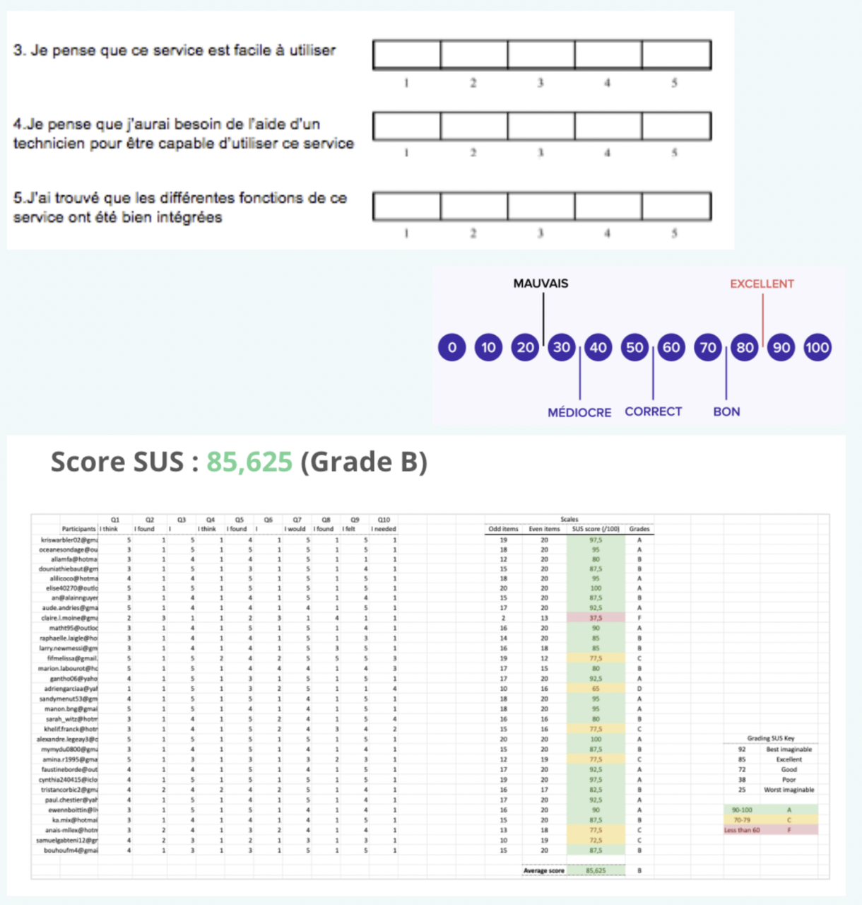
SUS stands for System Usability Scale, this standardized American survey was developed in 1986; it focuses more on usability. SUS consists of 10 questions and uses an agreement scale from 1 to 5.
Although the questions asked are dated, this UX questionnaire is still widely used. With fewer questions, it is one of the simplest models to use. It is used in particular in surveys, because it provides an objective dimension of the experience, whereas the interview will focus on a more subjective measure. The items, in the form of statements, ask the user to position themselves in relation to them. The user must evaluate their answer between 1 and 5.
Here are some examples:
- I think this service/product/system is easy to use.
- I think I will need the help of a technician to be able to use this service.
- I found the different functions of this service to be well integrated.
When to use SUS?
- For all your needs related to usability and ergonomics;
- For your prototypes (such as wireframe, and more advanced ones), mock-up, on site deployment. Useful for UI design teams in particular.
Note that it is really interesting to use it at the prototyping stage, because the questions “how easy is this task to do?” and “how well organized is the site?” provide a quick overview.
UMUX and UMUX-Lite | Measuring usability with simplicity
Their full name is “Usability Metric for User eXperience”; these two questionnaires developed by Intel in 2010, are excellent alternatives to SUS. Of more recent design, their results are similar according to the studies. They simply have fewer items (4 for UMUX, 2 for UMUX-Lite). A UX questionnaire format which is more adapted to the needs than to the requirements of the client.
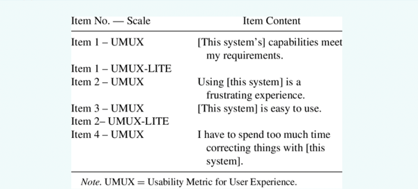
UMUX is divided into 2 positive and 2 negative statements, they are:
- The functionality offered by this system meets my needs.
- Using this system is a frustrating experience.
- This service is easy to use.
- I have to spend too much time fixing things on this system.
The user has to answer using a Likert scale from 1 to 7.
Since 2013, an even simpler model has emerged: UMUX-Lite. Unlike its big brother, this survey contains only the positive UMUX items.
- The functionality offered by this system meets my needs.
- This service is easy to use.
When to use UMUX and UMUX-Lite?
- For all your needs related to usability and ergonomics;
- for your prototypes (such as wireframe and advanced types), mock-up, on the deployed site, comparative test version A/version B. Useful for UX and UI design teams.
For our part, and unless we are specifically focused on the use of SUS, we recommend using UMUX instead, which is easier to use and above all more up-to-date.
NPS | For UX research recommendations
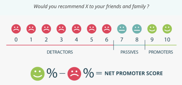
Short for “Net Promoter Score”, this metric was popularized in 2003 by Fred Reichheld, a famous American businessman. This marketing questionnaire is still used by many UX Research, communication and marketing teams. It allows to predict the attractiveness and excitement of a new service and to envision how it will be adopted and promoted by users. It can be interesting to use it for quantitative studies, test new offers, or mobile applications.
The NPS comes in the form of a single question: “How likely are you to recommend us on a scale of 0 to 10? ”.
When using it, keep in mind that it is a recommendation and not an intent to use or purchase. The latter are still different from NPS. Because wanting to use a product and recommending it are different: you can recommend an app without feeling the need to use it.
When to use NPS?
- To measure a recommendation intention, a purchase intention;
- for prototyping, pre-production phase (recipe environment), on site deployment.
The Kano model | Categorizing and prioritizing features
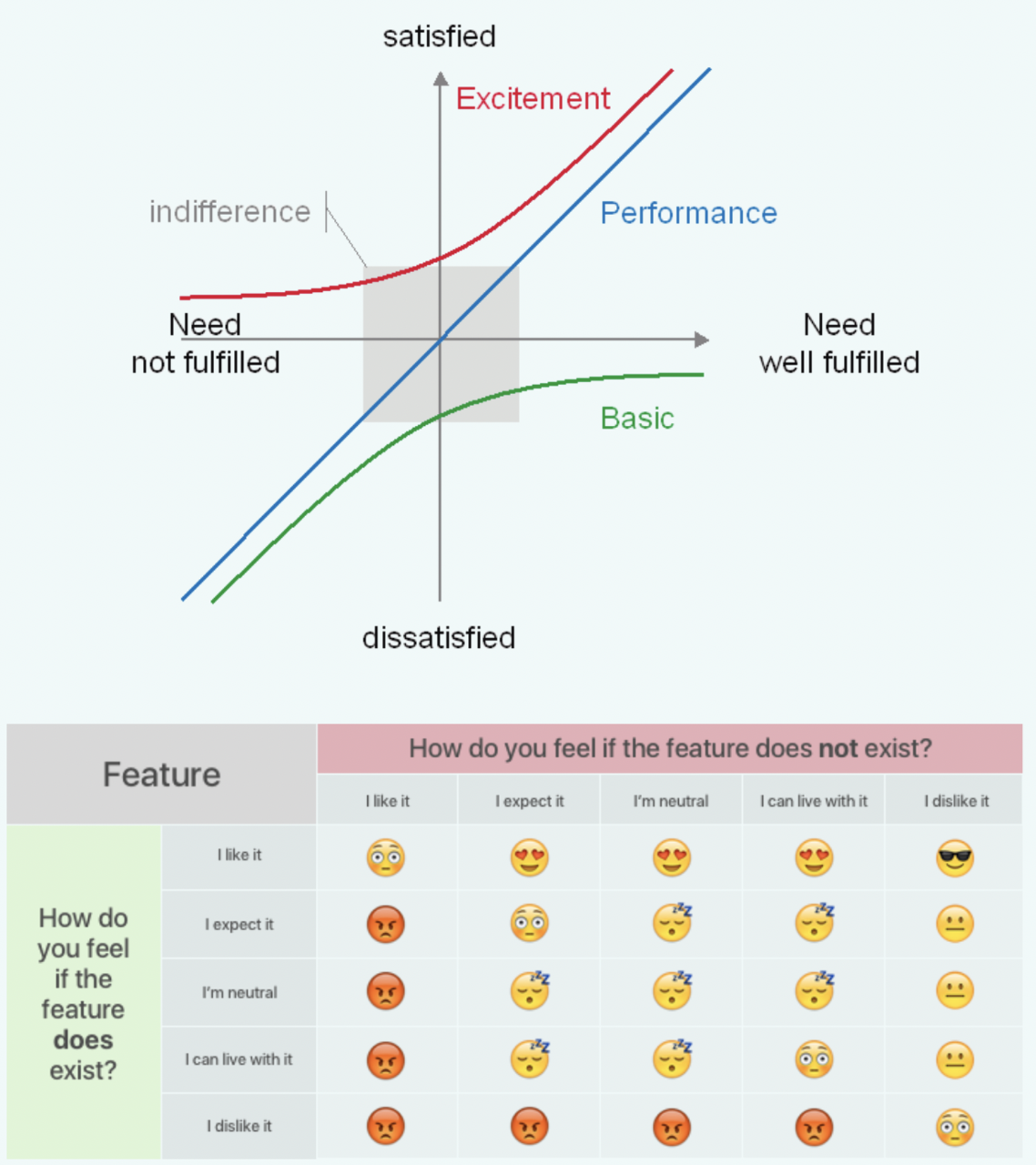
This UX questionnaire linked to the Kano diagram was theorized in 1984 by Noriaki Kano. It is a design that is used to represent the level of satisfaction of a user with a product or service. Based on the principle that the level of satisfaction is not symmetrical to the level of dissatisfaction, the Kano model can demonstrate that the absence of certain functionalities is harmful to the user experience, without improving it when they are present (and vice versa). This questionnaire is therefore used to prioritize features. Once this is done, it is necessary to determine whether a very satisfactory feature should be added to the roadmap in relation to its profitability.
Kano’s model helps to classify the features into 4 categories:
- Must-haves (or “basic expectations”): their absence or deficiency causes dissatisfaction.
- Performance: client satisfaction increases with the quality of the functionality.
- Bonusesor “nice to have”: e.g., the loyalty program of an application when it is unexpected. If they are present, users are surprised and delighted.
- The indifferent: no one cares if these features exist or not.
The corresponding survey combines a form of negative and positive questions to evaluate the importance of each feature.
When to use the Kano model?
- To prioritize the features in a roadmap.
As you can see, each tool meets specific needs and there are several kinds of questionnaires to measure UX. As for NPS and Kano, they can bring interesting complements on the recommendation or the features. You now know how to use them and we are sure that you will be able to make the most of them!
To go further, you can also read our page on our qualitative and quantitative approaches and on the different UX methodologies we deploy.
Did you like this article? Share it on social networks and subscribe to our newsletter to keep up with the latest UX news!
All articles from the category: User research | RSS
