June 12, 2018
Successfully putting together wireframes to test your new website or mobile application
What are wireframes? Definition:
Wireframes are used in the creation of an interface in order to visually define its structure. This mock-up stage allows us to define the paths and locations for the various features of a product.
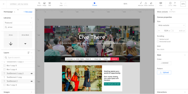
Example: Wireframes from the Airbnb homepage
What purpose does it serve?
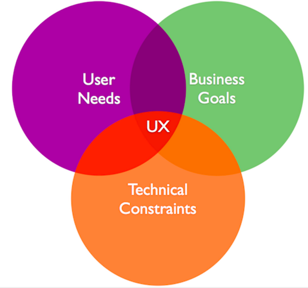
This step allows you to validate the heart of the experience - in other words, the way the features are offered to users. It is important to anticipate all the options from a technical and visual point of view at this stage, in order to move the cursor from dream to reality. The goal is to align your business goals, chosen means of technology and user needs in order to create the best user experience possible.
Our advice before you start: think about bringing together the people in charge of development, business strategy and design during this phase in order to avoid any unpleasant surprises later on.
How can you put together wireframes in an agile way?
The goal is to find the shortest path, in terms of time and budget, toward the experience that will allow you to meet your stated objectives.
1. Building low-fidelity wireframes
“Prototyping is to explore, not to prove”, Ed Catmull, President of Pixar
As its name suggests, a low-fidelity wireframe's purpose is not to hash out details, but to create space for discussion and product testing. It is therefore unnecessary to refine it, since the discussion should focus on the experience you are trying to create; not its execution.
We'll offer you a few guidelines to help you in this stage:
-
Concentrate on the First Use Case, which is the main reason the user will use your website or application. For example, if you provide a money exchange service for students through a mobile application, focus on this usage scenario, even if tomorrow you have other target audiences using your service.
-
Keep things simple and consistent. Details tend to distract the user from their objective. Stick to the basics.
-
Use real content (even if it's going to change). This will allow you to better understand feedback after user testing, and to evaluate the emotional connection your product creates.
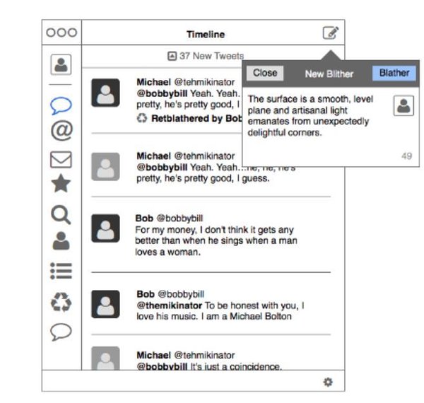
Example of a low-fidelity wireframe for Twitter
2. How to perform user testing on low-fidelity wireframes
The goal of these first tests is to validate (or not) the direction in which you are headed. It is therefore important to keep in mind the possibility that this direction will be struck down.
The key to analyzing the results of these tests is empathy. It is important to understand the challenges of your test users, and to see beyond their reactions in relation to the prototype form.
3. Building high-fidelity wireframes
Unlike low-fidelity wireframes, the goal at this stage is to validate a maximum number of elements regarding the user experience. These high-fidelity wireframes should therefore present your product in the most realistic way, keeping in mind that the motor is not yet functioning.
4. Wireframe validation
The goal at this step is to place the user in a situation that's close to reality in order to validate the path, ergonomics, and visuals currently in place.
"We wouldn't dream of building things without users", Anais Vivion, CEO Beapp
This is the last step before the development stage, so it's important to align everyone around the approved elements, all while knowing that web-products continually evolve.
In order to maximize the benefits of this step, we advise you to document the choices made in order to allow the developers and designers to build the product as approved.
Three things to remember to test your wireframes:
-
Focus on the experience and its merit before execution.
-
Test early in the process.
-
Get everyone involved in the wireframe's approval.
All articles from the category: Design user testing | RSS
