December 9, 2020
Ferpection survey - Flat Design? Skeuomorphism? Which style for designing an interface
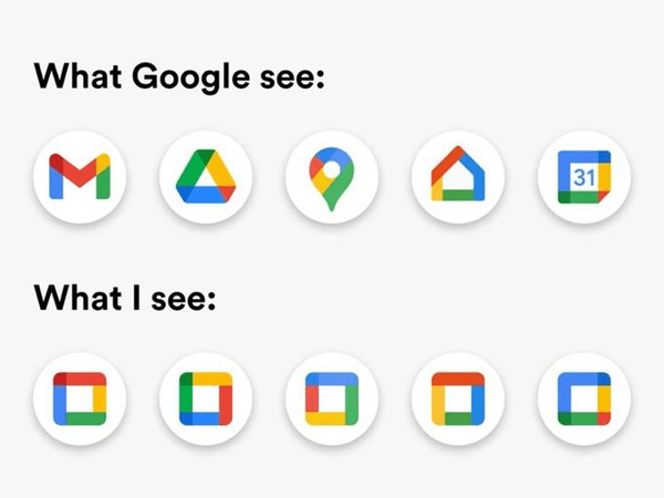
Last October, Google unveiled the new logos of its software suite, with a new design for its 5 main apps (Email, Calendar, Drive, Docs and Meet). The giant wanted to improve its design, but users' reactions were rather mixed, even a bit mocking.
Clearly, when it comes to design, trends come and go. But when it comes to interface design, wouldn't it be more appropriate to leave fashion aside and focus on how our users feel by leveraging a more scientific UX research approach?
So between skeuomorphism, flat design, neumorphism and material design, what is their position?
This article aims to give an objective overview of the last few years' tendencies. It is based on a quantitative survey made with 137 French people from 18 to 55 years old.
So between skeuomorphism, flat design, neumorphism and material design, what is their position?
This article aims to give an objective overview of the last few years' tendencies. It is based on a quantitative survey made with 137 French people from 18 to 55 years old.
Before looking at the study, let's define the different types of design
First of all, what is skeuomorphism?
Skeuomorphism is the art of faking: For example, painting fake marble or fake wood on plaster, or putting LEDs on fake candles to create lights that look like old fashioned chandeliers.
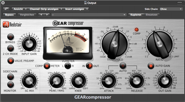
In the digital interface industry, this type of design was very popular in the 90s. It uses real life objects to represent interfaces that serve the same purpose. For example, an app giving time uses a very realistic clock, an interactive zone uses the picture of a light switch, an app giving temperature looks like a mercury thermometer, etc.
In the digital interface industry, this type of design was very popular in the 90s. It uses real life objects to represent interfaces that serve the same purpose. For example, an app giving time uses a very realistic clock, an interactive zone uses the picture of a light switch, an app giving temperature looks like a mercury thermometer, etc.
Interface of an audio software that looks like a physical panel (Author: Klaus Göttling)
Flat design, everything seems basic, or in other words is "flattened"
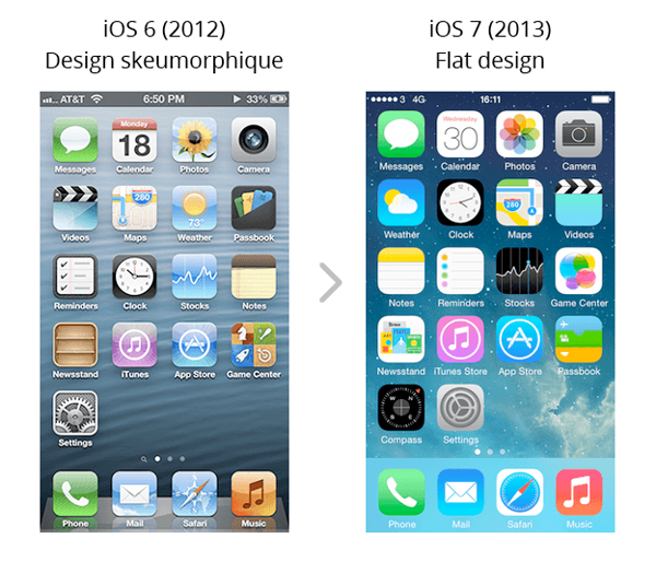
As a response to skeuomorphism, the years 2010 saw the emergence of a very radically different UI tendency: flat design. This Swiss movement appeared in the world of graphic design in the 1920s and is based on legibility and minimalism. With its simple geometric shapes and grid systems, paper graphics comes to flatten and streamline interfaces, with for example the release of Windows 8 in 2012 and iOS 7 in 2013.
Apple Inc. - Own work
Material design, from "flat" to Google
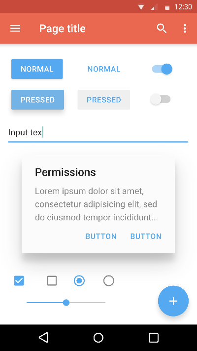
Apple's and Windows' flat design has often been contrasted with Google's material design, even though it's actually a continuation of it. Actually, Google wants to standardize all user interfaces using a strict grid and a set of "physical" rules. The basic idea is that the screen, no matter if it is a smartphone or a computer, has a thickness in which we can superimpose several layers of flat elements, like a pile of paper sheets. So, designers take the "flat" elements and give them a small shadow, very subtle, to materialize their presence. The "flat" takes a few millimeters of thickness but the design remains basic and more structured than ever.
Google Inc. - Own work based on Material design
Neumorphism, the latest trend
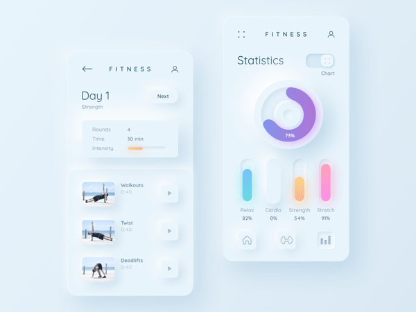
The current major trend among interface designers is neumorphism. This new term created from "new" and skeuomorphism is actually more an evolution of material design than a real comeback to skeuomorphism. Where "material" cuts out certain "flat" elements to bring them to the foreground, neumorphism imagines that the background itself is distorted in depth or in 3D to create the interface. The background is then treated as a smooth virtual material, entirely solid, often of a slightly cold gray, which allows to create 3D with shadows and light reflections.
Interface fitness - neumorphism (Author: Mary Tokar, source: Dribbble
Users' opinions on these 4 types of design, what the quantitative study says?
1. Users are sensitive to changing patterns
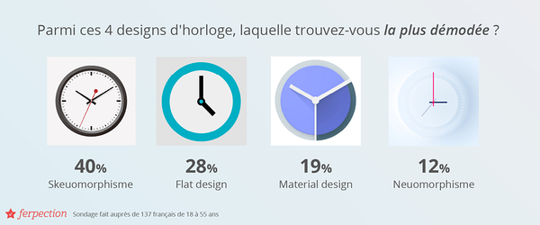
The 4 clocks below were displayed to the survey sample, and respondents were able to properly rank the 4 designs in order from most to least outdated.
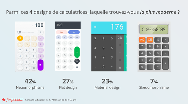
Same for these 4 calculator designs, the results roughly rank the designs in chronological order (with a slight switch between "flat" and "material").
Same for these 4 calculator designs, the results roughly rank the designs in chronological order (with a slight switch between "flat" and "material").
2. Skeuomorphism is easier to understand
Although users are able to recognize the more "old-school" or retro side of skeuomorphism, it doesn't necessarily mean that they don't like it.
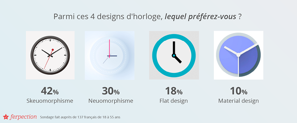
In fact, again among the 4 clocks, 42% of the survey sample prefers the clock, closest to a real clock, with the highest level of detail, and thus corresponding to skeuomorphism.
One of the testers interviewed, Noah (49), called the design "the simplest without complicating life" and Erika (36) called it "basic in appearance but easy to use and understand". Actually, the similarity with the real object is reassuring. The user knows how to use it in real life, so he can easily project himself in the virtual world.
3. Flat Design, more aesthetic but too strict
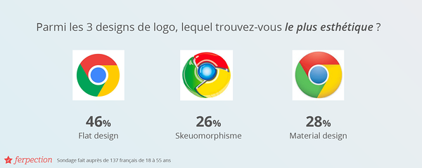
On the different sets of visuals submitted to the survey sample, flat design was mainly chosen as the favorite. For example, on the Google logo, flat design is the winner. Almost half of the respondents prefer it (45%) and find it more aesthetic (46%).
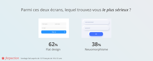
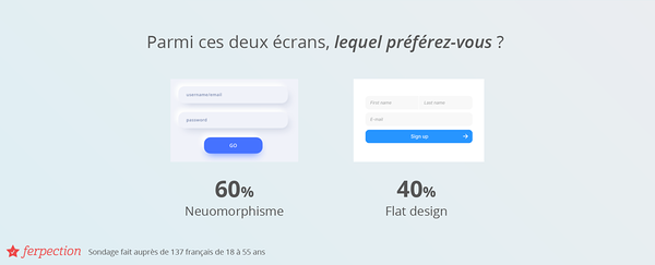
On the other hand, on the forms below, although 62% find the first interface more professional, 60% of the users prefer the second one, finding it more attractive.
It is generally the simple and refined aspect of flat design that gives it its aesthetic appeal, according to the respondents: "it is basic and refined which makes it pleasant" (Thomas). At the same time, it confirms the sober and professional look, which can also be less appealing to users depending on the situation.
In a lesser way, but still worth noting, 25% of users feel that the skeuomorphic Google logo is the most aesthetically pleasing. The attention to depth and texture can give some users the impression of a more polished image, as this user describes about the calculator visuals, "I like this style as if it were 3D." - Ali (36)
4. Material design? Not so original...
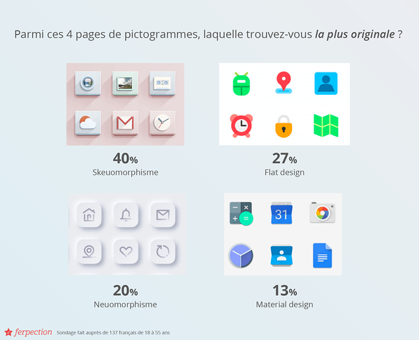
Material design having mostly influenced the last few years, and being supported by Google, it is unsurprisingly considered rather ordinary. On the criterion of originality, it comes in last place for respondents when they are shown the pictograms below.
On the other hand, it should be noted that skeuomorphism is no longer used by our UI designers, which makes it rarer. Actually, 40% of the respondents thought that skeuomorphic pictograms were the most original.
On the other hand, it should be noted that skeuomorphism is no longer used by our UI designers, which makes it rarer. Actually, 40% of the respondents thought that skeuomorphic pictograms were the most original.
5. Neumorphism, high-end but lacking in contrast
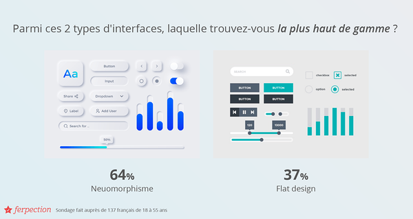
For the interfaces below, but also for the calculators shown previously, it is actually neumorphism that comes out on top. In both cases, it is the design preferred by the respondents. But above all, this type of design appears to them as more upscale as one user explains: "The white color of the D calculator brings out the sleek and premium aspect at the same time". This is confirmed by the interfaces below, as 64% of respondents found the left version more premium than the right one in flat design.
On the contrary, users do not react positively to buttons in "pure" neumorphism. This is because keeping the strict definition, buttons remain the same material as the background, and therefore the same color. This offers very little contrast and does not attract the user's eye.
On the contrary, users do not react positively to buttons in "pure" neumorphism. This is because keeping the strict definition, buttons remain the same material as the background, and therefore the same color. This offers very little contrast and does not attract the user's eye.
Conclusion
In conclusion, although neumorphism seems to be the "latest" trend, the choice of design will depend on your brand image, the message you want to convey, and what you expect from the user. For a bank, flat design may be appropriate because it will tend to send a professional image, while neumorphism may be preferred for a luxury brand, but it should be avoided for "call to action". In any case, we can only advise you to listen to your users to choose the design that corresponds to their expectations and will allow you to offer them a satisfying experience.
For your next UX studies and user tests, find our services, personalized according to your objectives and your project.
All articles from the category: User research | RSS
